ISSUE: Journal of Art & Design
Introduction
ISSUE was a paper publication published four times a year from 2008 to January 2017, documenting research work andprojects done at the HEAD – Genève, an international school of art and design based in Geneva, Switzerland. The school board wanted a digital successor to this printed medium to communicate about everything happening around art and design research at the school.
The platform had to be a scientific and research journal, a means of diffusing contents, events and projects, and an archive of all research-related content produced by people working or affiliated with the institution.
The original publication format, in addition to a slow rythm conditioned by the printed medium, had to concentrate on finished projects and theoretical analysis. The new platform had to create a dialog between critical reflection and experimental creation. We needed to present on the same level research done in an academic setting and more practical experimental explorations. The difficulty was to create an editorial place where a lot of publications with divergent formats and spirits could coexist: theoretical texts, creations of various natures, records of conferences, updates on ongoing researches, outstanding student productions, etc.
In short, the need was a structure that could accommodate contents of very diverse natures, temporalities and sources, relate them to each other and store them in an easy to browse archive.
Sitemap

From the beginning I worked closely with Charlotte Laubard, who is at the origin of the project. She and a first reflection committee had already put down the four categories and their type of content. I took these ideas and shaped them with an architecture and some quick userflows.
Userflows


Wireframes
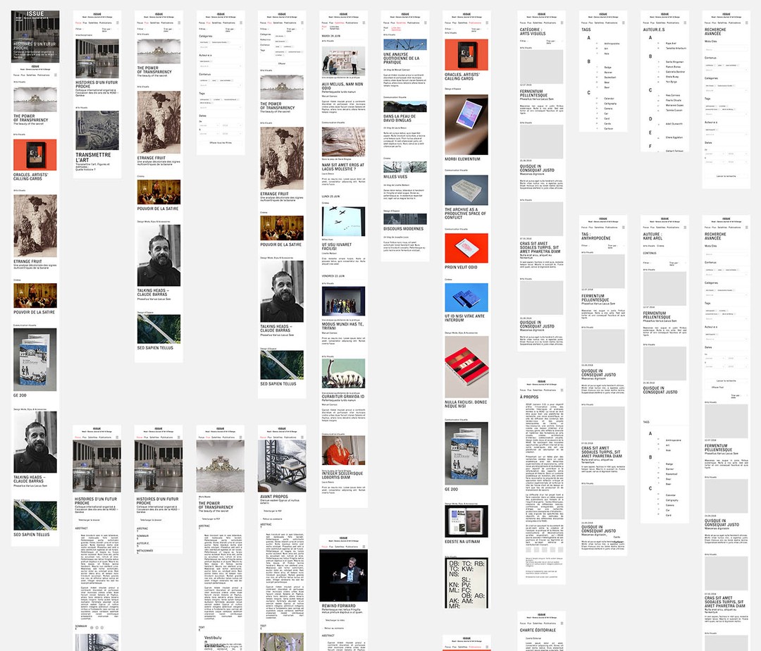
Once the structure of the website was validated, I worked on the wireframes. There was a lot of back and forth between the school board, consulting professors and myself.


Layout
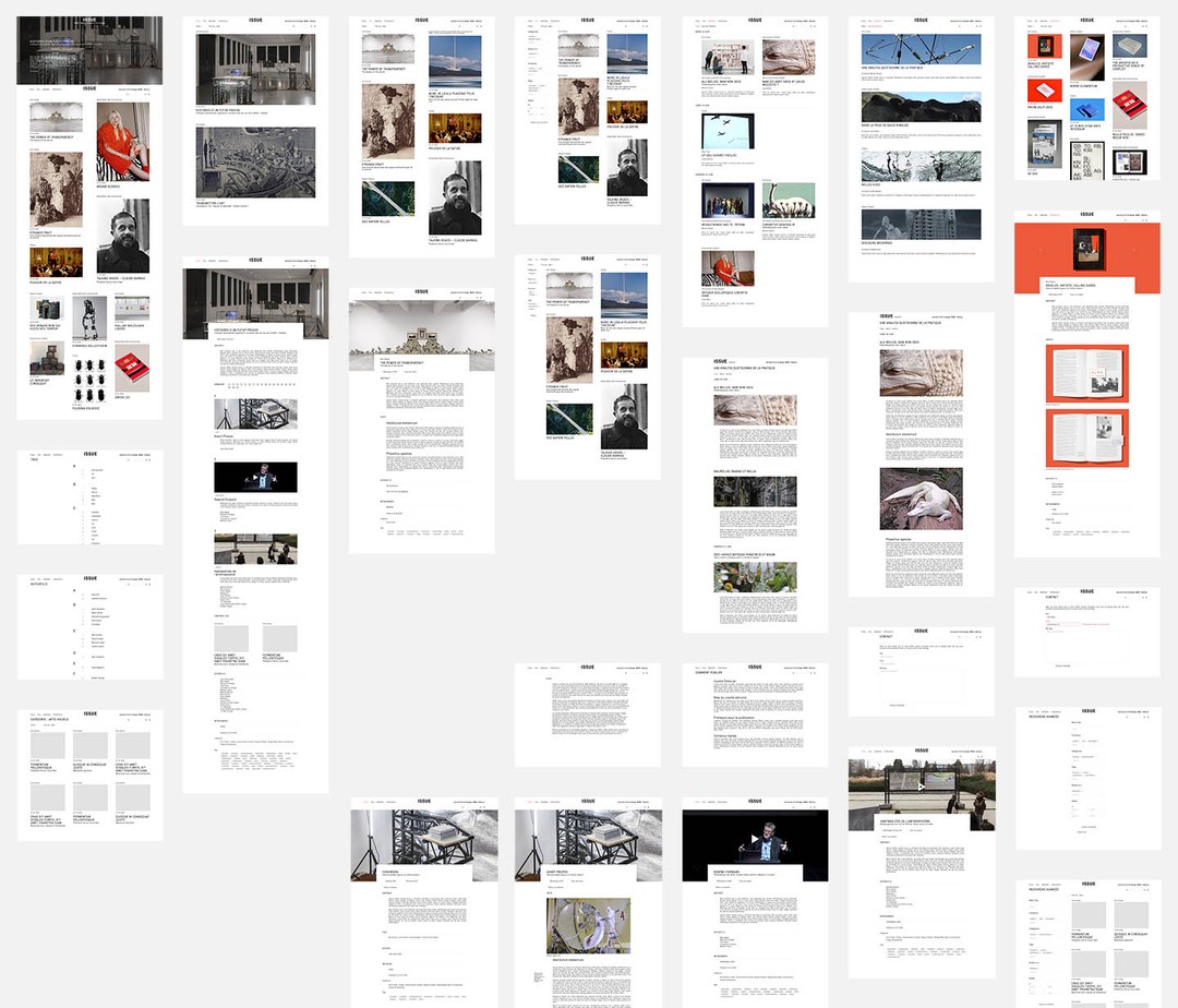
I chose a 24 column grid with 20px of gutter. This type of grid allowed me a lot of flexibility in the design of the layout. I kept the layouts as simple as possible but I chose a different one for each of the main category pages. One column for the focus category, two for flux and satellites and three for publications.

The rest of the website is set in a narrower layout using indentations to separate the titles from the content. This allows for a comfortable reading and a simple hierarchy of information.

Design
I then designed the interface with the advices of Vincent Sahli who designed the school's visual identity.


Production
The website was then developped by Catherine Brand, Pierre Rossel and Vincent Zaugg. We maintained a dialog throughout the production phase to ensure a close match between the design and the finished product.
Testing was done in-house with an alpha version being released to a dozen of person with interest in the project. They were tasked with controlling the consistency of the experience as well as point out major bugs. As we reached the end of production, close to a hundred people were given access to the platform with the aim of ferreting out the last of the bugs and glitches. Finally, the website was released to the public in its entirety on the first of march 2019.


